Burza rada

The single place for everything needed for job hunting*

Role

UX/UI, prototype

Duration

12 weeks

Tools

Figma, Adobe CC

Platform

Responsive website

Industry

Recruitment

The Croatian Employment Service (HZZ) is a public institution whose mission is to address employment and unemployment-related issues in the broadest sense. Over 500,000 people visit their Labour Exchange Job Search Board (Burza rada) every month. Their mission is to assist both job seekers and employers in finding their ideal match.

*This case study is not affiliated with or endorsed by HZZ. The project was conducted for educational purpose.

Context

Recognizing the need is the primary condition of design

Despite Burza rada being the largest and most well-known job posting platform, with over 500,000 visitors each month, the number of active resumes in their database is surprisingly low at only 1850. This figure is lower than that of their competitors and could be the result of some obvious usability issues such as complex navigation and sign-up/log-in flow, no feedback on the users’ actions, outdated design with visual hierarchy and spacing issues, and poorly structured content. This self-paced project aims to improve and make finding and applying for jobs personalized, quick, easy, and efficient for everyone involved.

Why redesign?

The website was last redesigned in 2016 making the current design outdated and not visually pleasing. As a user, I’ve noticed some patterns that negatively impacted my user experience. The outdated UI, lack of visual hierarchy and information structure, spacing issues, cluttered navigation, complex sign-up and log-in flow, and inability to customize your job-hunting journey all contributed to a poor user experience. That prompted me to further research and learn how other users felt about the website, and what steps could be taken to refresh and update the current design and experience. 

Tailoring user experience

Even though Burza rada is a site for both job seekers and employers, the redesign is focused on the user experience of job seekers. The aim is to improve overall user experience based on forum discussion entries and competitor analysis, and design a personalized website that is easy to navigate and use, and suitable for all age groups and educational levels.

Research

Know thy users

Due to time constraints and respondent unavailability, forum discussion entries were analyzed. Although this method doesn’t pinpoint specific pain points, it highlights potential usability issues and common user goals. In addition, other job portals (both Croatian and foreign) were analyzed to determine their strengths and weaknesses in order to identify what could set Burza rada apart from its competitors.

Job seekers are eager to read and provide feedback on employers. They want to gain insight into the company’s culture, values, and salary before applying to a job posting. With the prevalence of repeated job ads, many people are hesitant to apply without first reading feedback on employers.

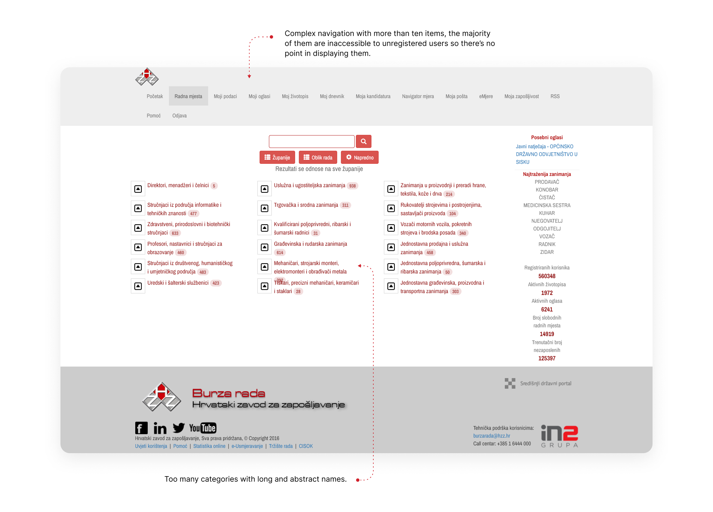
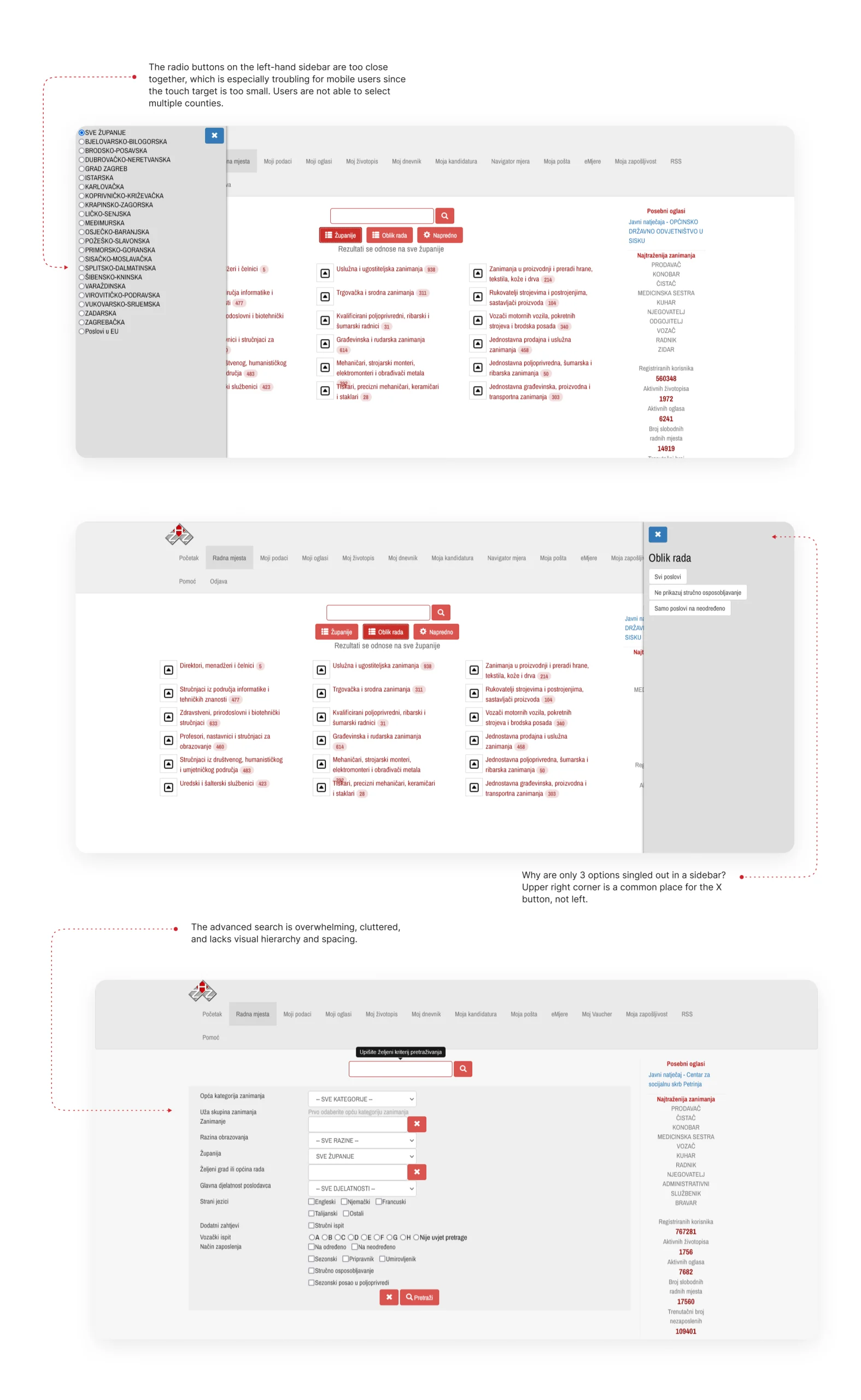
Having the ability to search for jobs by category is a desirable feature. However, irrelevant suggestions can make the user interface feel impersonal and cluttered. Filters are a great way to narrow down your search and make the job search process more efficient. Refining these filters could make the process even more efficient.

Sending job applications via email or the easy apply feature is preferable to sending applications via the post office.

Detailed job descriptions and feedback on job applications provide a sense of security, transparency, and credibility.

The job alert feature is a useful tool, however, users have reported that it often does not work as intended. Usually, users are sent job postings that are not in line with their desired criteria or educational background.

A competitor analysis showed that a personalized path is something that many job portals are missing. Landing pages are often visually cluttered with a large number of job ads that are not tailored to the user’s needs and preferences, creating a cognitive overload and overwhelming visitors with information. A personalized path needs to make users feel as if the job ads were hand-picked just for them. It’s a plus if this journey is also enjoyable, delightful, and enhanced with an aesthetically pleasing design that builds trust and credibility. 

The easy apply feature commonly found on job portals greatly streamlines the application process. This is especially beneficial when the feature is paired with the ability to quickly select and upload previously prepared documents, such as a CV, cover letter, and any additional required documents.

Most of the analyzed job portals have a straightforward sign up and log in flow. There are clear instructions on how to complete registration and upload important documents such as CVs or cover letters. 

Most of the portals fail to provide trustworthy reviews of employers, as they typically only provide basic profile information. Users want and expect more than that. 

User personas

Recent Graduate

Sanja is a 22-year-old recent graduate from a four-year university with a degree in marketing. She has limited work experience and is eager to start her career. She also finds it difficult to find job openings that match her qualifications and interests.

The pain points

Sanja is aware that she is competing against many other recent graduates for entry-level positions, and her lack of work experience makes it difficult for her to stand out. Sanja is having trouble finding job opportunities that align with her skills and interests, she feels overwhelmed and uncertain of what to look for.

The-job-to-be-done

Sanja is looking for a platform that can help her in streamlining the job search process, by providing a wide range of job listings from different companies and industries, and the ability to narrow down her search by location, salary, and job type. Sanja wants to be able to find job listings that match her qualifications and experience, even with her limited work experience. She wants to be able to filter through job listings quickly and easily. She wants to be able to access the platform from any device, whether at home or on the go, to make the process more convenient and accessible.

Mid-Career Professional

Dario is a 40-year-old professional with a bachelor’s degree in finance and an MBA. He has over 10 years of experience in various roles in the financial industry. He is looking for a new challenge, but he is facing some difficulties in his job-hunting journey.

The pain points

Dario feels undervalued in his current job and is looking for a job that will make him feel appreciated and valued. He wants to find a job with stability and security. He is struggling to find roles that are a good fit for him. Dario is also concerned about standing out among a large pool of qualified candidates.

The-job-to-be-done

Dario wants to be able to filter through job listings quickly and easily, without having to manually sift through irrelevant listings. He also wants to have the ability to save or apply to multiple jobs at once, to make the process more efficient and save time. Additionally, he wants to receive notifications when new job listings that match his qualifications and experience are posted, to ensure that he doesn’t miss any opportunities.

Unemployed High School Graduate

Katarina is a 55-year-old individual who has a high school diploma. She has over 20 years of experience in the manufacturing industry. She is stable, dependable, and looking for a steady job after a period of unemployment.

The pain points

Katarina has been unemployed for an extended period of time and is finding it difficult to find job opportunities due to her gap in employment history. Employers are reluctant to hire her because of this gap, which is causing her to feel discouraged. Katarina is worried that her gap in employment history will make her appear out of touch with current industry trends. She is concerned that this might make her less competitive as a job candidate. She is struggling to access job search resources and support, which makes her feel overwhelmed with the job-hunting process.

The-job-to-be-done

Katarina wants to learn about the job market, including which industries are hiring, what skills are in demand, and what to expect in terms of salary and benefits. She needs a platform that can help her filter job openings by location, experience level, and industry to save time and increase the chances of finding the right fit. She wants to have access to reviews from current and former employees, so she can get an idea of what it’s like to work for a potential employer and decide if it’s the right fit for her.

User journey map

Pain points

Read and leave feedback on employers

According to the discussion forums, users want to read and write reviews on employers. They want to learn more about their potential workplace, such as the company’s culture, values, and salary. Many people have become suspicious after seeing frequently repeated job ads, and are reluctant to apply to such postings.

Transparency

Users would like clearer, detailed job descriptions and feedback on an application.

Log in and Sign up options

The website offers only one registration option (an e-Građani account). This may limit the number of registered users, as creating an e-Građani account is more complex and time-consuming than creating a LinkedIn or Google account.

Search by category and filters

Users appreciate the ability to find jobs by category, but irrelevant suggestions feel impersonal and clutter the UI. Filters are highly used tools when searching and could be more straightforward.

Complex navigation and unavailable links

The current navigation is too complicated. The majority of the displayed items are linked to the user’s profile and are inaccessible to unregistered users.

Goal

One size fits all

The website is geared towards high school students, people who have only completed elementary school, graduates, people with no prior work experience, people with work experience who are looking for a change, and retired people. They all have to be able to navigate the website and find information easily and simply.

How to relate it to people?

Understand users pain points that could make applying or searching for a job difficult and redesign a centralized portal for job seekers and employers. The objective is to make finding a job quick, easy, transparent, personalized and intuitive for everyone involved. The main goals are to achieve transparency through reviews, ratings, detailed job descriptions, and salary disclosure, simplicity with an easier sign up and log in process, as well as clearer landing page for easier content scanning, and quality by matching the user’s needs, skills, and experience with the job postings and creating personalized path.

Create a responsive website so that users can access it from any device (desktop, laptop, and mobile primarily).

Issues with the current design

1. Landing page

The current landing page doesn’t provide all the information about the site’s services, and the emphasis is on employers rather than job seekers. Users see generic images and vague service descriptions, and maybe aren’t enticed or motivated to sign up because they are unaware of the benefits. Despite scarce information, the content on the page is hard to scan, and too many elements are fighting for the visitor’s attention. The main goal is to organize the information in an easy-to-understand format and briefly explain what signing up offers and how it can help users find their dream job.

2. Log in and sign up

Currently there is only one method for logging in and signing up (via an e-Građani account). Users have to go through a rather complicated process to create this type of account. Even if they already have one, logging in requires them to go through the tedious process of connecting a smart card reader with their laptop or obtaining an OTP code if they are using other digital credentials. What happens if they don’t have their mobile phones with them to obtain the OTP code? This method is more secure, but unnecessary and overcomplicated for everyday use. Some users commented that the language used on the e-Građani site is confusing, making it difficult to navigate and log in or log out. Given that this is the only way to create an account on the Labour Exchange website, it is possible to assume that this is one of the reasons why users are reluctant to register and use the site to its full potential.

One of the potential solutions to increase the number of registered users is to provide them with more registration options, mainly registering through social media platforms.

3. Navigation and job categories

With more than ten items, the current navigation is too complicated. Most of the displayed items are linked to the user’s profile and aren’t useful to unregistered users. When an unregistered user clicks on them, they’re directed to the landing page with no further instructions that they must register to gain access to them. There is also an alignment issue since the logo is not in line with the navigation items. The names of the categories are too long and abstract, and some of them could be combined.

4. Filtering and advanced search

The layout and arrangement of the advanced search and filters are confusing. The search flow is complicated, as are the language and options, and the overall design lacks visual hierarchy, spacing, and clarity.

Design assets

Iconography

Colours

Typography

UI Design

1. A new landing page and navigation bar

The redesigned landing page focuses on the content, utilizing ample whitespace and relatable imagery of individuals to establish a sense of friendliness and trustworthiness. The utilization of red, a key aspect of the brand identity, was maintained in the redesign. The shade of red has been refined to appear more modern and vivid, while the background color has been changed from grey to white to further emphasize the content and call-to-action buttons. Rather than displaying numerous job postings on the landing page, which could potentially overwhelm visitors, only a select number of popular job categories are highlighted. Different navigation options are presented depending on user login status. Links that were previously inaccessible to unregistered users are now hidden and can be accessed upon registration (profile, job applications, documents, reviews, saved job postings, messages).

2. Sign up and Log in process

Registration and login options have been expanded to include the use of both e-Građani account or social media platforms. In the previous design, there were distinct sign up and login flows for job seekers and employers. Employers had more options and instructions for password recovery and assistance. The redesign features two separate tabs for login and registration. To differentiate between profile types (a job seeker or an employer), users must first select the account type before proceeding to select their preferred registration method.

3. A successful registration and profile creation

Upon successful registration, the user is directed to a next screen where they are notified of their successful registration and given the option to complete their profile or skip it for the time being. In the previous design, there was no indication of successful registration and no guidance on how to complete a profile, which is a crucial aspect of the easy apply feature and CV generation.

4. A landing page for registered users and transparent job postings

The landing page for registered users has been redesigned to provide a personalized experience, featuring job postings tailored to their skills and preferences as stated in their profiles. The previous version of the job posting details was disorganized, with no clear visual hierarchy and lack of transparency for important information such as salary, reviews, and requirements. In the redesigned version, the details are clearly separated into distinct sections for ease of scanning, and additional features such as employer profiles and reviews have been included. Salary and requirements are now openly disclosed.

5. Jobs categories and advanced search

The job category names have been shortened and made simpler for ease of scanning, with accompanying icons to indicate their corresponding category. The advanced search feature now includes filters to aid in quick and efficient searching. The options for filtering are presented in the form of chips, making the tasks easier to complete and content easier to sort.

6. Employer reviews

Employer reviews are a valuable tool for individuals considering job opportunities. Aside from personalized path, this is a feature that can set Burza rada apart from other job portals. Credible and useful reviews, as well as detailed information on employers, can make the entire job-hunting process less stressful.

7. Rate an employer

The platform allows registered users to leave anonymous reviews and rate their workplace or job interview experience. The process is divided into three steps to make it less cumbersome for users.

8. A user profile and CV generation

Filling out a profile can quickly become tedious, and in that case users are more likely to abandon it. To address this issue, the platform has been redesigned to divide the process into smaller, more manageable steps with clear instructions. Once completed, users have the option to view or download their profile in the form of a CV. The easy apply feature allows users to attach their profile as a CV and submit other necessary documents.

Responsive design

With more and more job seekers accessing job platforms via mobile devices, having a responsive website means that the platform can reach a wider audience, potentially increasing the number of job applicants. A responsive website provides a seamless experience for users regardless of the device they are using, making it easier for them to access job information and apply for jobs on-the-go. Overall, a responsive job platform website helps to create a better experience for job seekers, improves the platform’s reach, and can lead to increased conversions and better outcomes for job seekers and employers.

Next