A mobile app that provides quick, easy, and secure access to quality health services over the phone. Request prescriptions for you and your loved ones, track orders, and get updates on the status of your order. Save time and reduce the number of doctor’s appointments.
*This case study is not affiliated with or endorsed by SKVID. The project was conducted for educational purpose.
Context
A good idea poorly executed is a bad idea
People suffering from chronic illnesses or conditions prioritize timely access to their treatments. This app was created to connect people with their doctors and make ordering prescriptions as simple and quick as possible. Despite being a relatively simple and easy-to-use application, it failed to meet the users’ expectations and needs. People want more flexibility and convenience when it comes to accessing their medications. As a result, there is a valid reason for redesigning and adding new features to make the app more intuitive and useable.
People ignore design that ignores people
Attempting and failing to order medication by phone can be a frustrating experience for users, especially if they only have a limited window to call. Because many users can’t or don’t have time to visit a doctor, they need a simple, secure, and contactless way of ordering their prescriptions for themselves and their loved ones. Many users are dissatisfied with prescription ordering because they have no control over the process and the personal information they are required to share.
Goal
Out with the old, in with the new
The goal is, based on the user feedback, identify pain points and determine how the redesign can enhance user experience. To address user pain points, the design needs to balance functionality, usability, modern UI design, and high security. The redesign must be done in such a way that there is a seamless transition from the previous application to the new one, with the learning curve kept to a minimum, while also ensuring that it is able to adapt and expand over time to meet the changing needs of its users.
Research
Know your competition
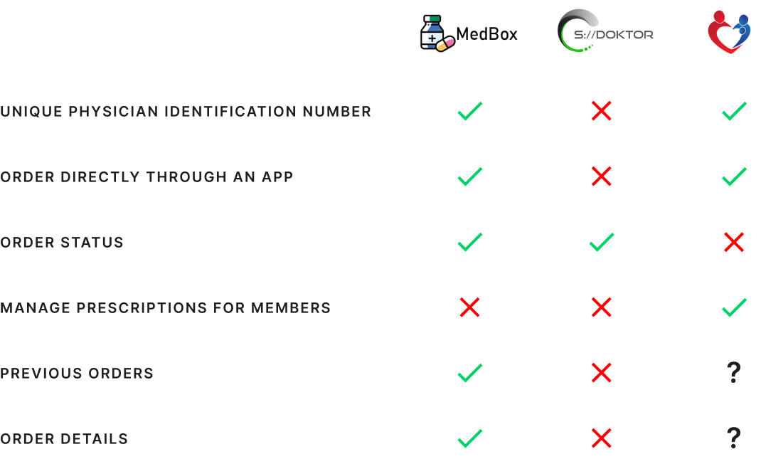
There is a similar app called MedBox in Croatia, but it is not widely used, with fewer than 100 downloads and no rating statistics. There is also a Health Portal app, but it requires users to log in with advanced digital credentials such as an electronic ID or bank token. Many users have complained about this method in their Google Play reviews. This app includes advanced features like messaging physicians, viewing previous visits, scheduling and canceling appointments, viewing lab results, and ordering prescriptions. The analysis focused solely on the feature of ordering prescriptions and aimed to evaluate the app’s effectiveness, functionality, and usability.
The most unhappy users are the greatest source of learning
More than 10,000 downloads show a particular interest in this app’s services. However, a 2.9 average app rating suggests that underutilized features hinder user experience. The 152 app reviews on the Google Play Store served as a good starting point for identifying main pain points.
User personas
The busy working mum balancing chronic conditions and medication management
Jana is a busy working mother in her mid-30s. She has several chronic conditions that require her to regularly take medication, and she often forgets to request refills on time.
The pain points
Jana doesn’t have time to go to the doctor’s office to request repeat prescriptions, and she is worried about running out of medication.
The-job-to-be-done
She wants to easily request repeat prescriptions directly through an app. She wants an app that will streamline the process of managing her prescriptions, and provide peace of mind in knowing that her medication is always readily available. She also wants to feel secure that her personal information is protected.
The busy caregiver managing multiple medication schedule
Ivan is a working adult in his late 50s. He is responsible for managing his elderly parent’s medication schedule as well as his own chronic condition. His parent has several chronic conditions and takes multiple medications, which can be difficult to keep track of.
The pain points
Ivan is often busy with his own work and personal responsibilities, and it can be hard for him to coordinate and manage both his and his parent’s medication schedules.
The-job-to-be-done
He wants to easily request repeat prescriptions for both himself and his parent, so he can keep both of their medication schedules organized and ensure they always have the necessary medications on hand.
Pain points
Inability to add family members
Users want to manage multiple members’ medications and order repeat prescriptions on their behalf using a single log-in.
It should be possible to manage multiple user accounts so that I can order prescriptions for myself as well as an elderly person who does not have a smartphone.
Static order status
Even after they have collected their prescriptions, the order status remains unchanged, indicating that their order is still ready for collection.
Not bad, but there’s definitely room for improvement. I got the prescription, but the order still says it’s ready for pickup.
Limited ordering methods
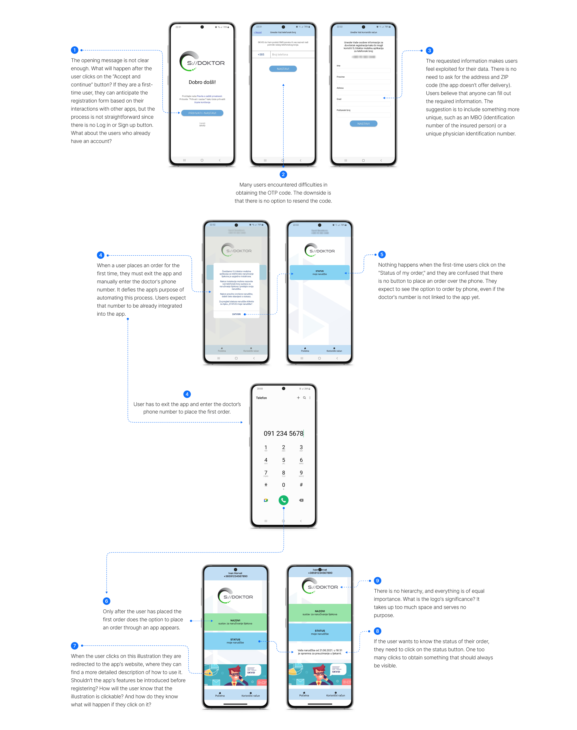
The application currently only supports phone orders, but users would like the option to order prescriptions directly through an app. Users struggle to see the app’s benefits because ordering by phone isn’t any different than how they already order their prescriptions.
I don’t see the purpose or benefit of this app. You need to install the application to order prescriptions by phone. I’ve been doing that without the app.
Unreliable sign-up process
The current process makes users feel uneasy and as if they are being used solely for their personal information. They would prefer a more straightforward and trustworthy sign-up process that uses something more secure, such as an MBO number (identification number of the insured person). Because there is no option to resend the OTP code, some users are having difficulty obtaining it and completing the registration.
I’m having trouble registering as the app isn’t sending a verification code to the entered phone number.
I like the thought behind it, but the execution isn’t ideal. It doesn’t, for example, ask for a MBO, so anyone can enter anyone’s personal information.
It seems to me like this app was designed only to gather personal information.
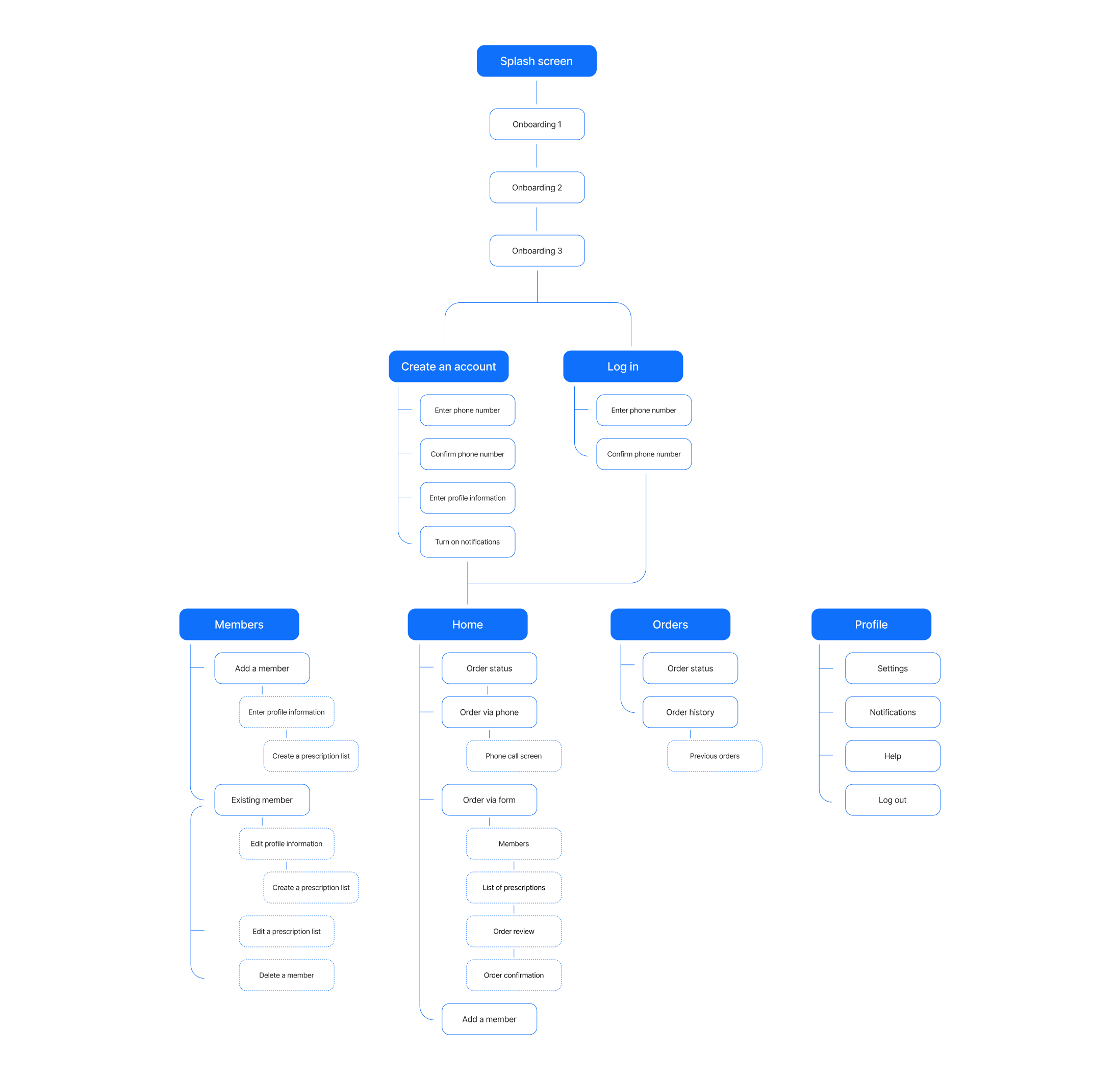
Current flow and issues
Information architecture
Rebrand
The Emperor’s New Clothes
After a competitor analysis and brief interviews, one thing came to light. A strong visual identity and branding influence how users perceive the product. Based on the current logo and the app’s name (S:// doktor), I asked a few people what they thought the app’s function was. The majority of them guessed it had something to do with health, but they had no idea what “S://” in the name stood for. The logo looks outdated and people associate it with something corporate. Therefore, before redesigning the app, the first step was to refresh the logo and come up with a more relatable name.
Due to a lack of design consistency, the idea was to unify the entire interface and have one distinctive color that reflects the main mission and key branding attributes. The primary goal is to ensure healthy lives and improve well-being. Key branding attributes include adjectives such as credible, practical, and trustworthy.
The redesigned logo is a white cross in a blue rectangle with rounded corners. The new name is Doktor+. The ‘S://” in the name was replaced with ‘+’, which was added to describe an advantage or good quality that app has. It offers more than just ordering prescriptions. Blue and green colors are associated with health and make good choices for medical logos. In this case, blue represents the main branding attributes – credibility, practicality, and trustworthiness.
Design assets
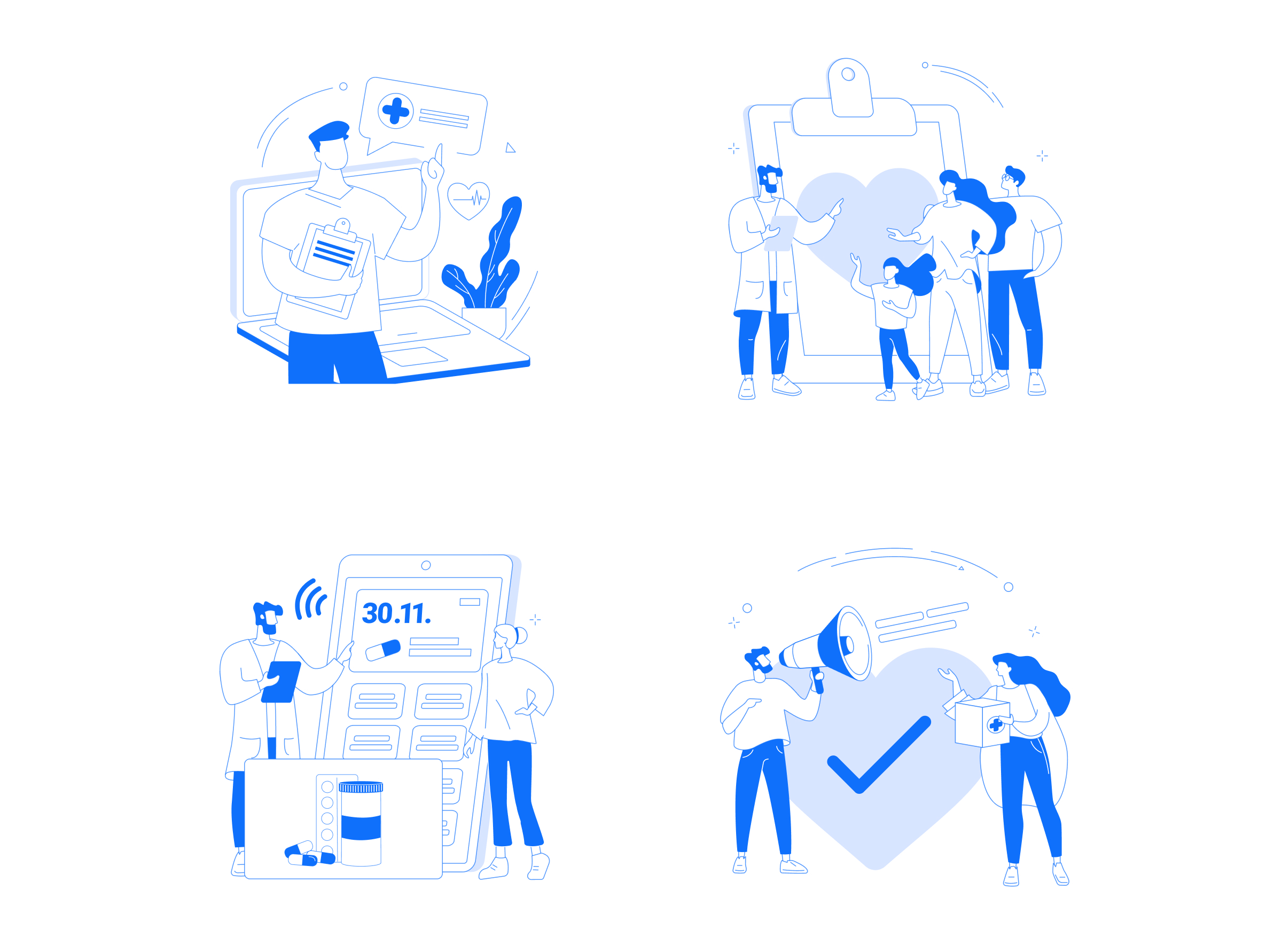
Illustrations
Iconography
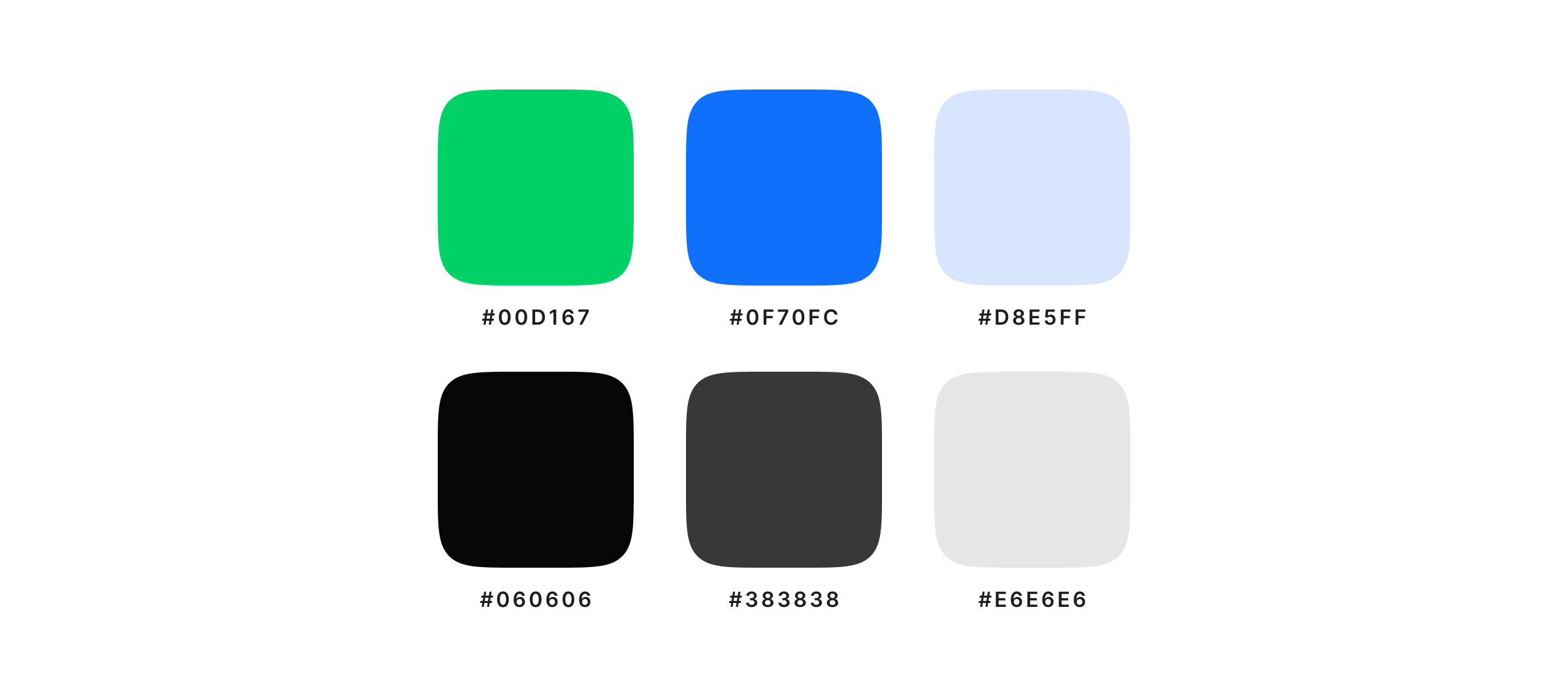
Colours
Typography
UI Design
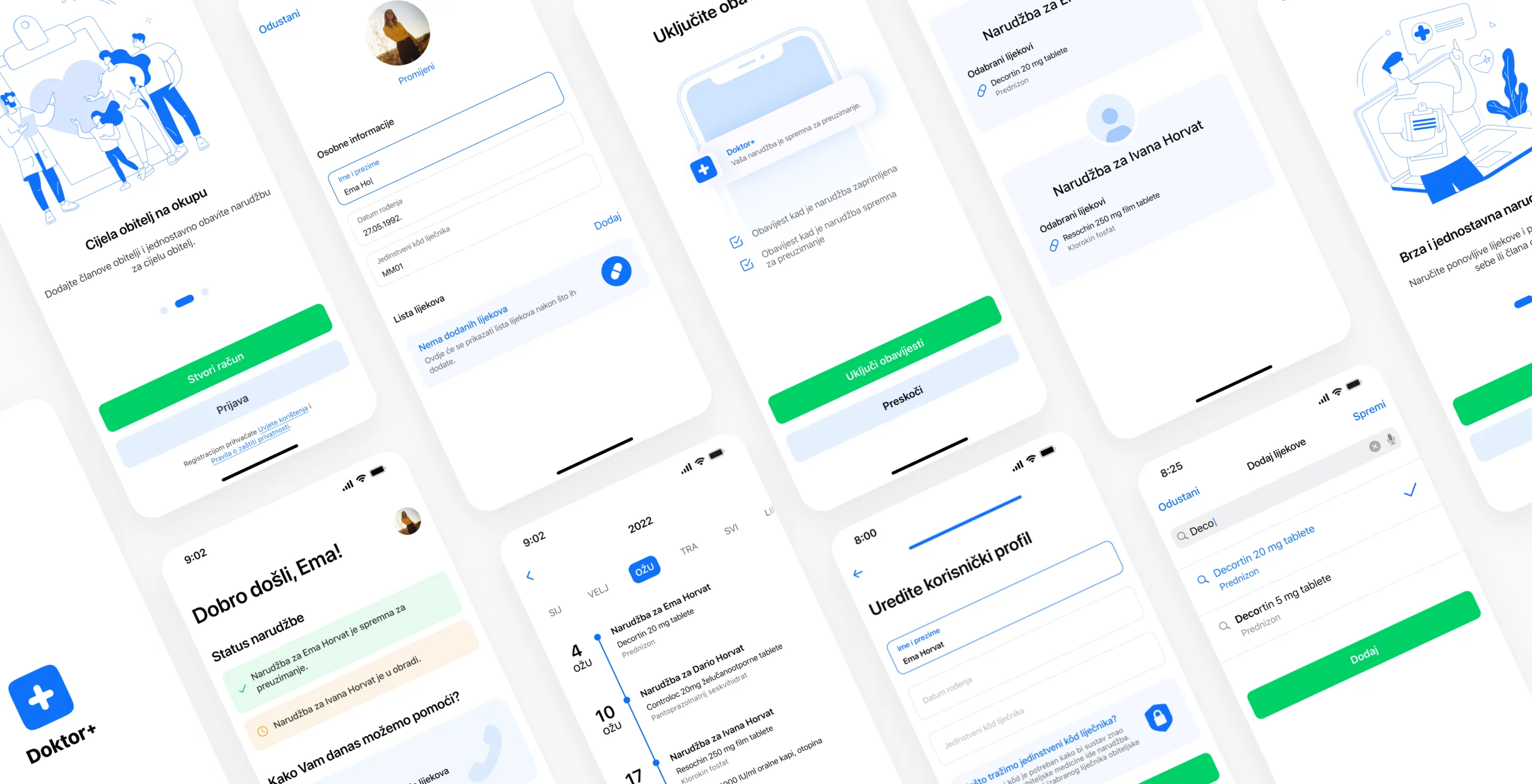
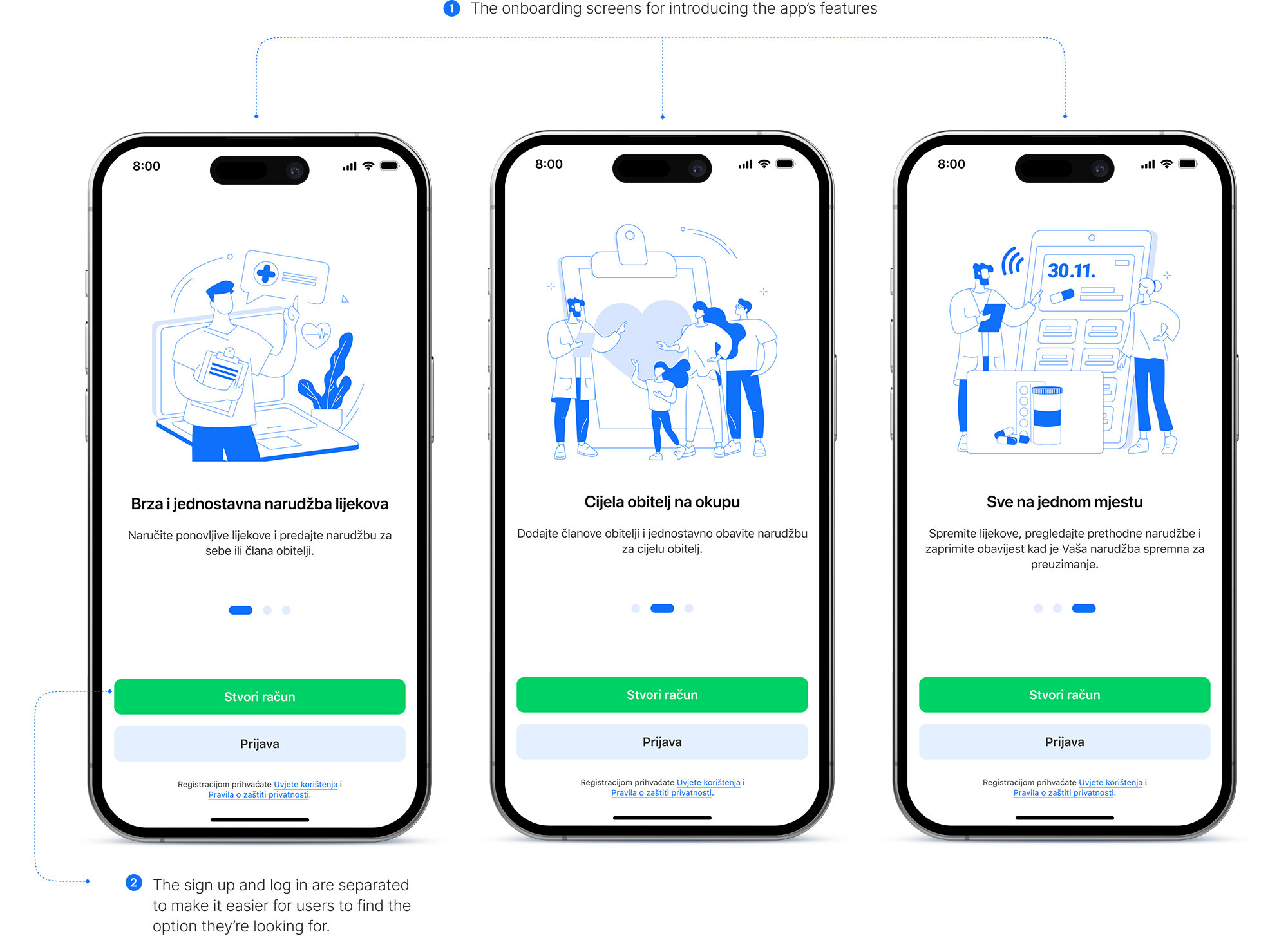
1. Onboarding
After creating an account, users had the opportunity to learn more about the app by clicking on the illustration on the home screen. The question is, how many users actually clicked on this illustration? When introducing new users to the app, it is essential to showcase the benefits of the app so that they don’t have to leave the app to learn how it works.
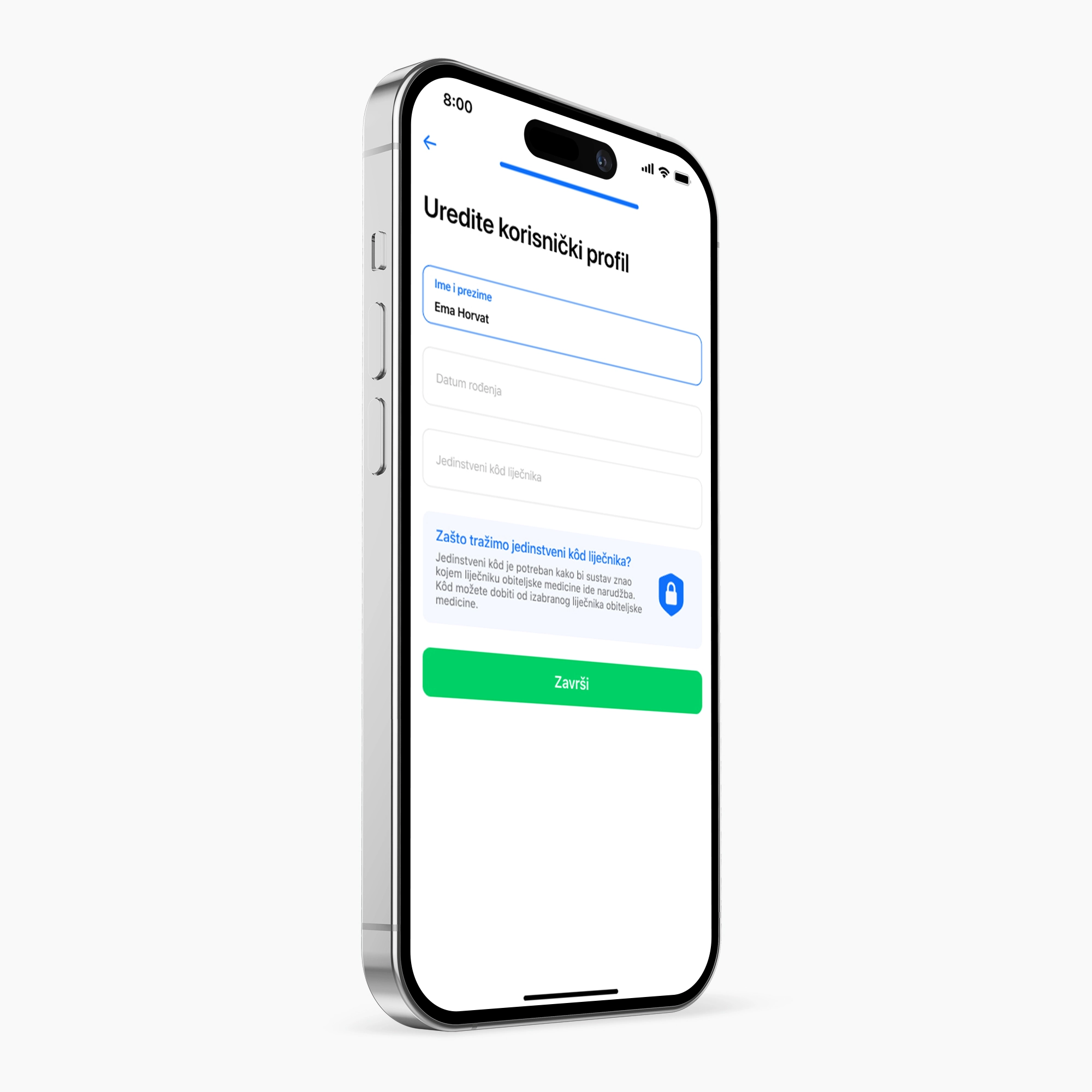
2. Increased security for sign-up process
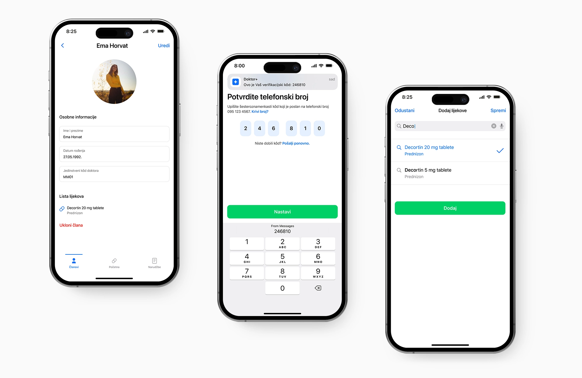
Some users have expressed concerns about the reliability of the current sign-up process. To address this, an additional verification step has been added in the form of a unique physician identification number, which is less accessible than a phone number or date of birth, to increase security. Additionally, an option to resend the OTP code has been added after receiving feedback that some users were having difficulties receiving it.
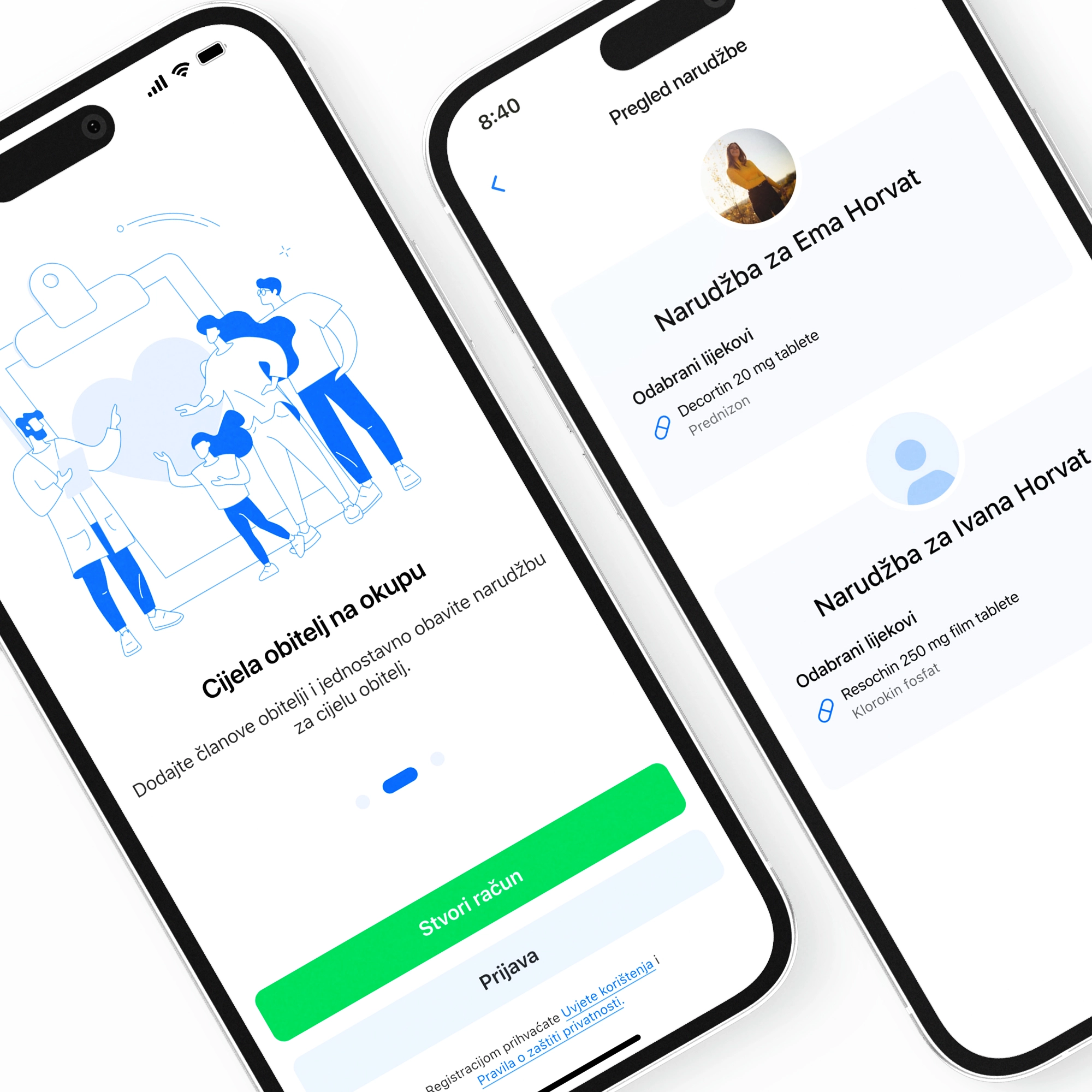
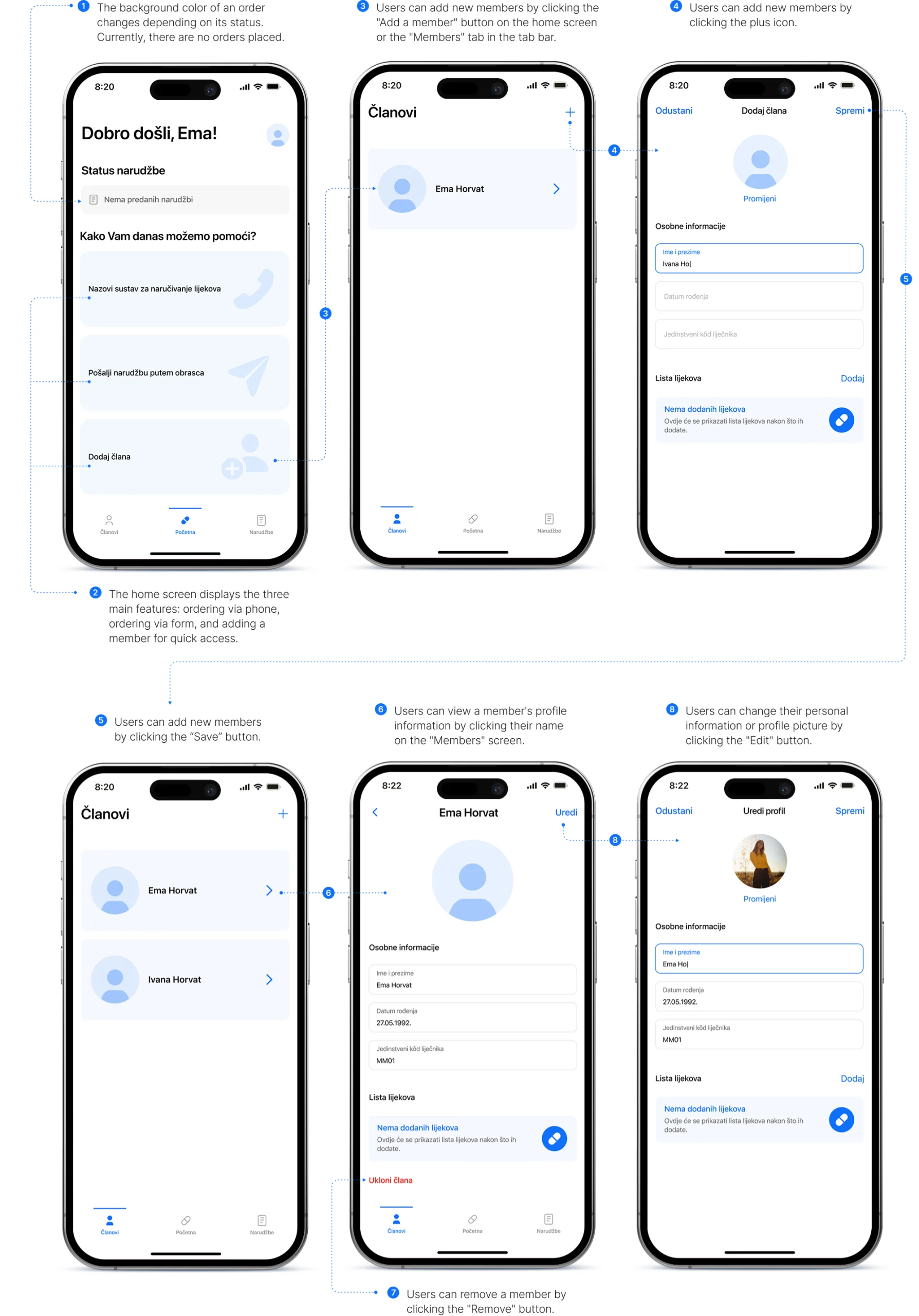
3. Add, edit or remove family members
One of the most frequently mentioned shortcomings of the current app is the inability to add family members. To address this, a new feature that allows users to add, edit, or remove members has been added. This feature makes the ordering process faster and more convenient for users.
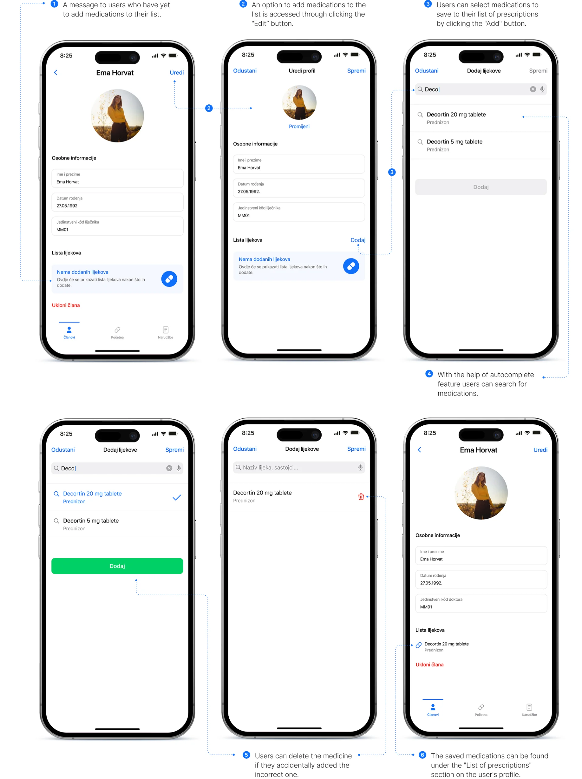
4. Save prescriptions list
A new feature that allows users to save a list of repeat prescriptions for each member has been added. This feature speeds up the ordering process.
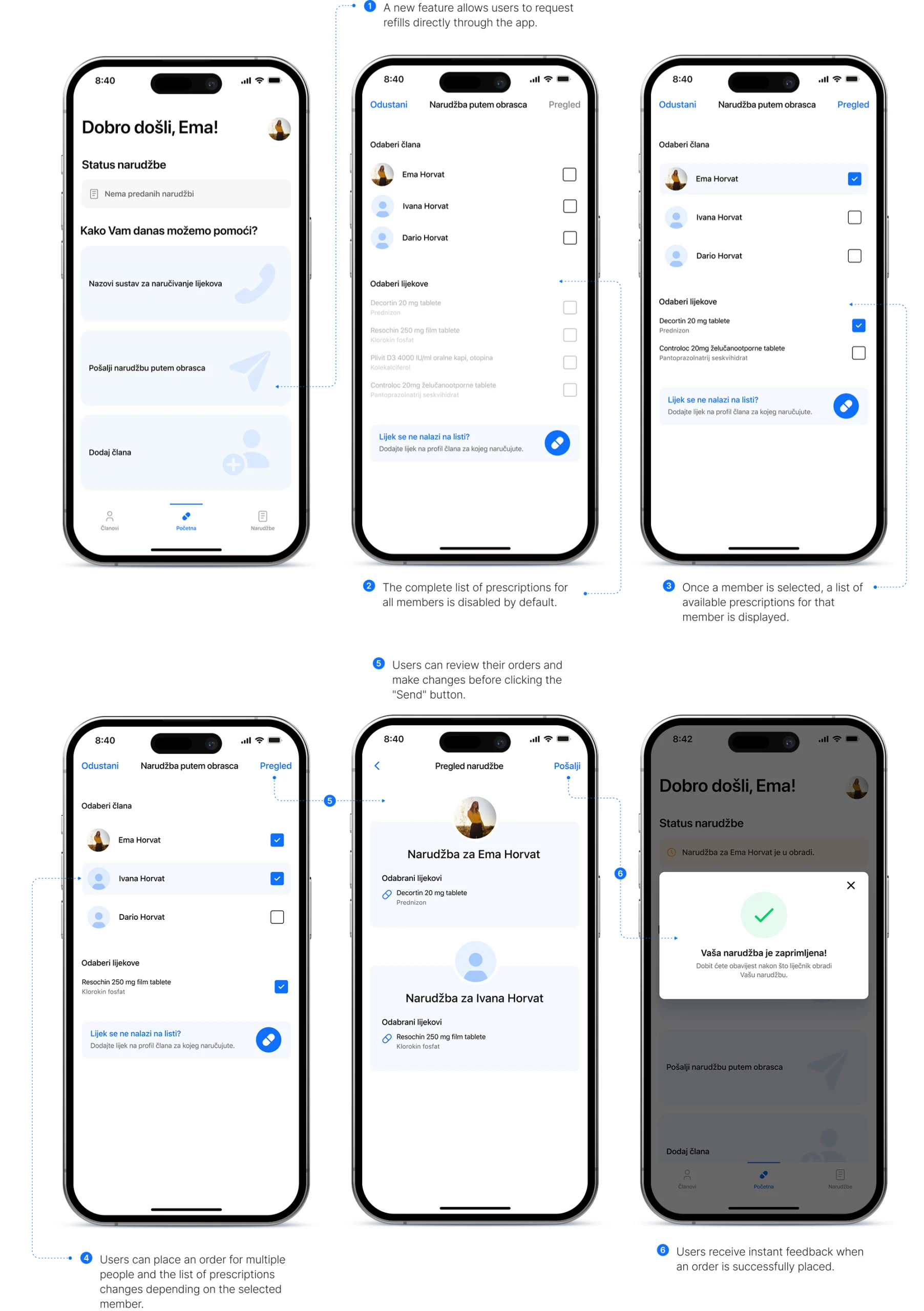
5. New ordering method
In addition to traditional phone ordering, the app now offers a new convenient way to order directly through the app. Users can choose for which member they’re ordering and select prescriptions from the saved list, making the process more efficient.
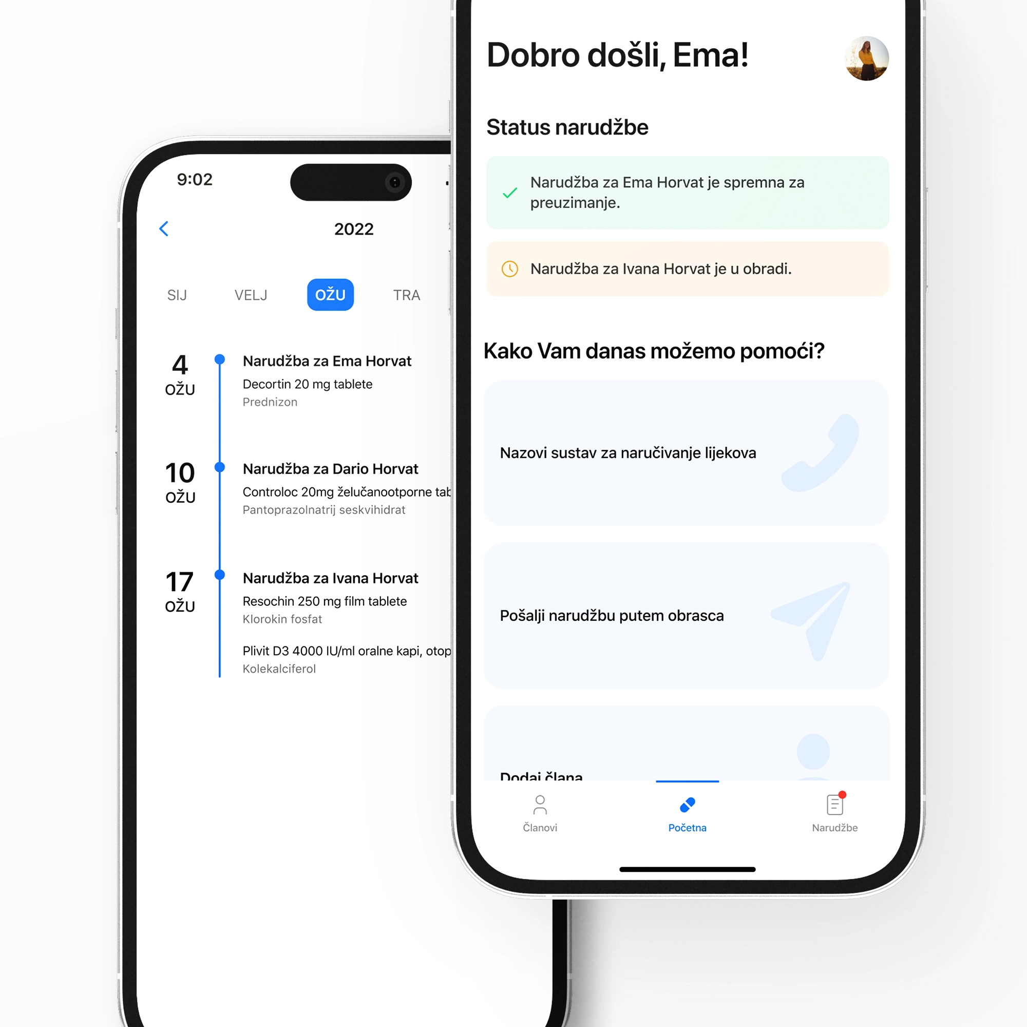
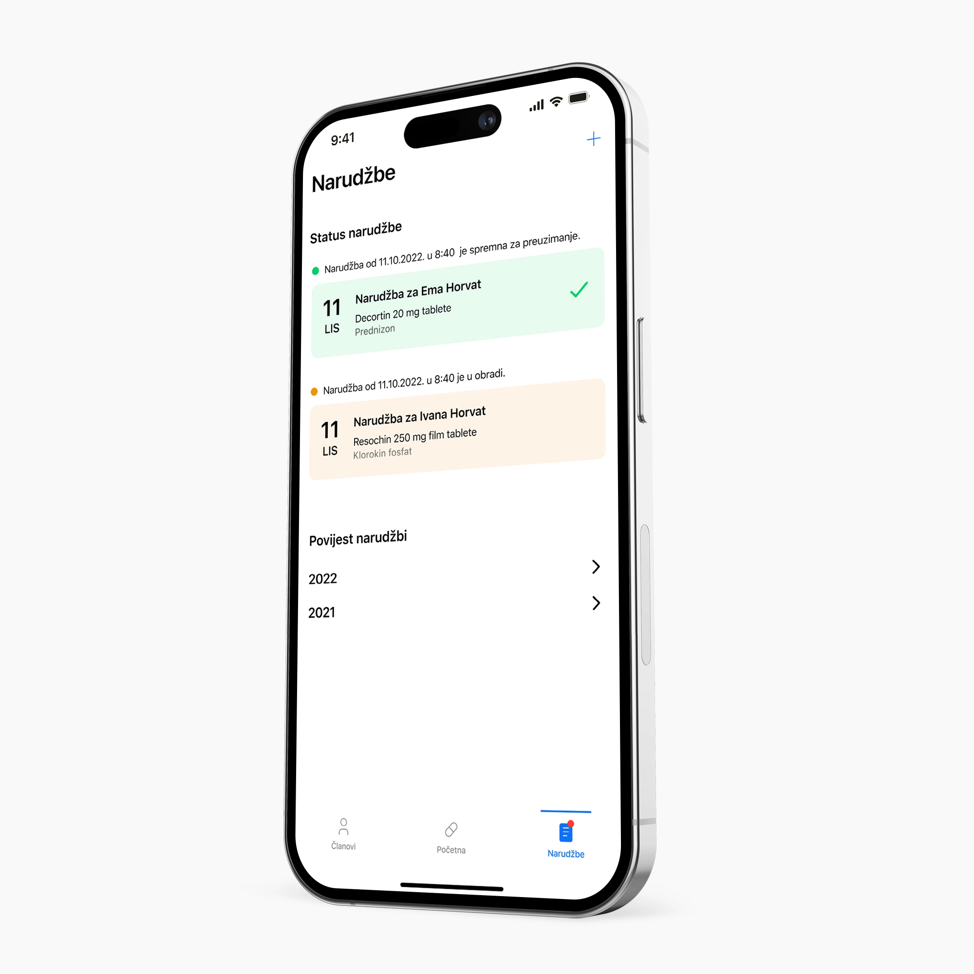
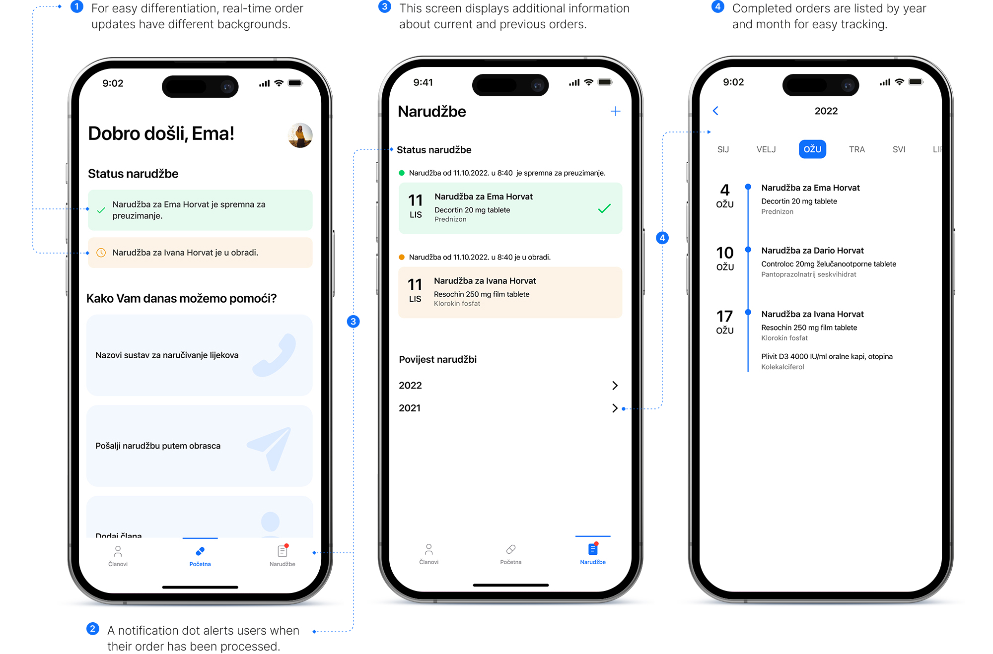
6. Order tracking and real-time updates
Under the Orders tab, users can find more detailed information about their orders. They can keep track of previous and current orders, which is beneficial for users whose prescriptions run out at different intervals. Also, users can now see real-time order updates until the order is picked up.
How to measure success?
Measure to learn, measure to fix
As the designer for this self-initiated project, my primary focus was to make sure that the user experience is user-friendly, efficient, and enjoyable. To achieve this, design choices were aligned with potential business objectives, which may include: boosting the app’s reviews and rating, growing the user base, increasing the number of downloads, enhancing retention rate, reducing the churn rate and monitoring monthly active users. To evaluate the redesign’s success, important metrics such as improved reviews and ratings, user base growth, and monthly active users should be analyzed. By meeting these goals, a seamless and engaging user experience will be provided, improving user satisfaction and retention.
Next steps
Scalability and additional functionalities
When redesigning the app, scalability was a crucial aspect. The new design has been created with the capability to easily add additional functionalities in the future. This means that if the redesign is well-received by users, the development team will have the flexibility to introduce new features and capabilities. Two specific features that have been identified as useful by users are prescriptions delivery and refill reminders. These features would allow users to set reminders for when their medication is due to be refilled and delivered to their door, helping to ensure that they stay on top of their medication regimen. Overall, the redesign has been created with the goal of making the app more user-friendly and efficient, while also ensuring that it is able to evolve and grow over time to meet the changing needs of its users.